In this story
- From a distance, the repeated format creates a rhythm across the wall
- Read the city names in the titles
- Colour and lettering vary even within the same logo
- Up close, different points brighten in each work
- Read the title alongside the wrapper's graphics
- Return to the same wall during the meal
- Questions about viewing the works on one wall
The short answer
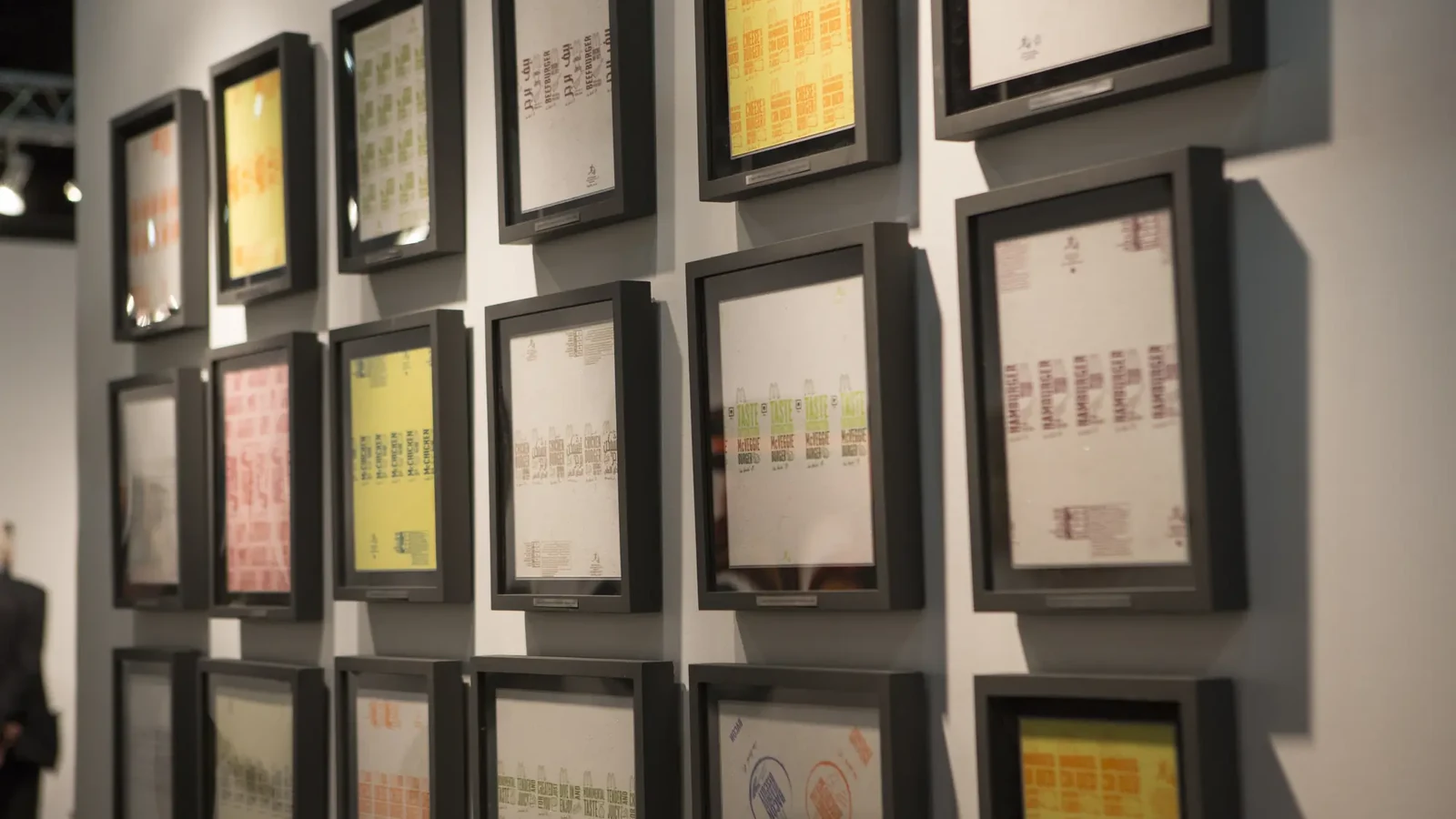
Across one wall, the format of the works and logos repeats, while the colours, lettering, graphics, and reflective points differ from one wrapper to the next. Each work is titled after the city where its wrapper was collected.
Three distances from which to view the wall
- From a distance, the repetition of the works and the rhythm of the whole wall emerge first.
- At a middle distance, differences in colour, logos and lettering become clear; the official title identifies the city.
- Up close, small points of light on the surface change with the viewer's position.
Into the story
From a distance, the repeated format creates a rhythm across the wall
Seen first from the table, the repetition of similar rectangles and familiar colours registers before the individual city names. The spacing and rows between the works make the wall read as one large composition.
At this distance, there is no need to strain to read the details. Notice where colours gather near the centre of the wall and how lighter and darker works alternate.
Read the city names in the titles
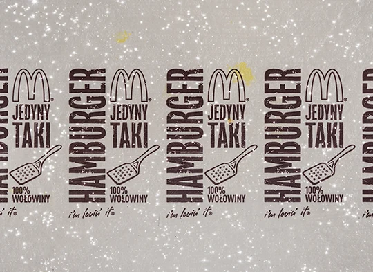
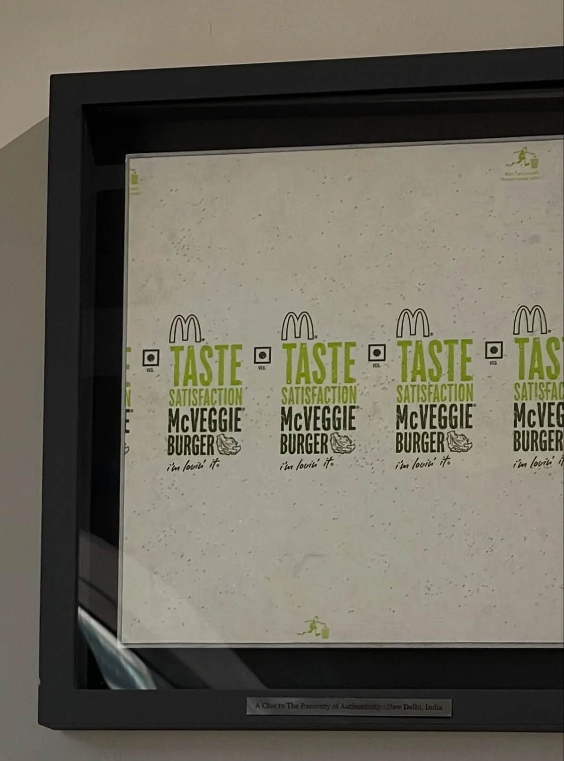
Cities and countries—including Tokyo, San Francisco, New Delhi, Seoul and Warsaw—appear in the titles of individual works. The medium and year are also recorded with each work.
Look first at the wrapper's lettering and graphics on the wall, then read the city title. This brings the visual differences and the place where the wrapper was collected into the same view.
Colour and lettering vary even within the same logo
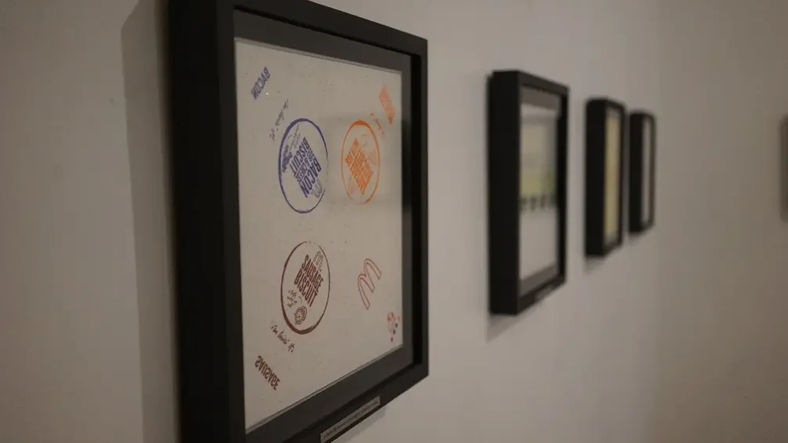
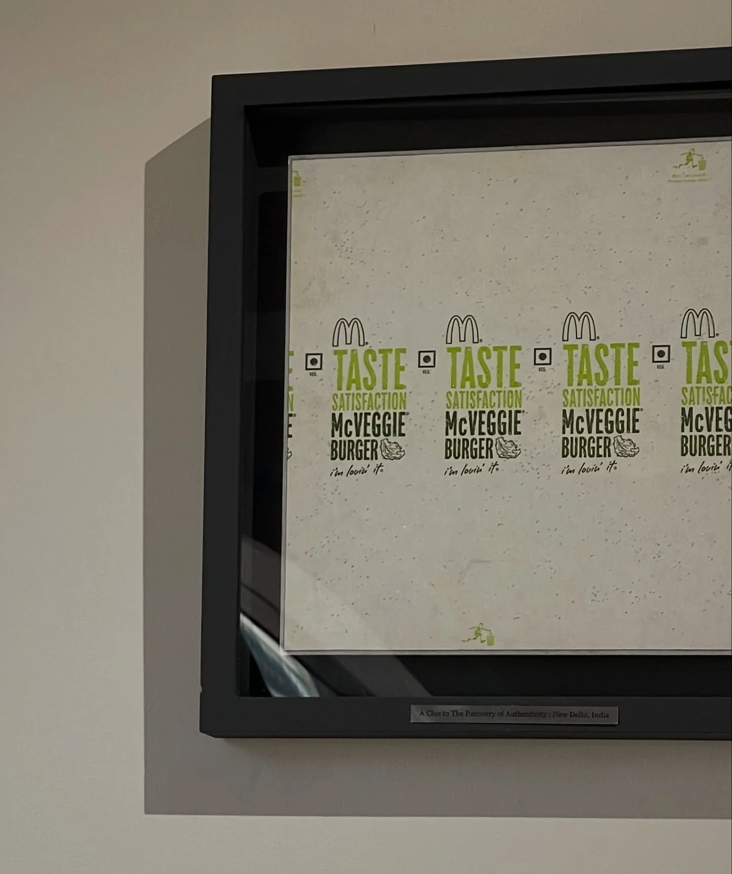
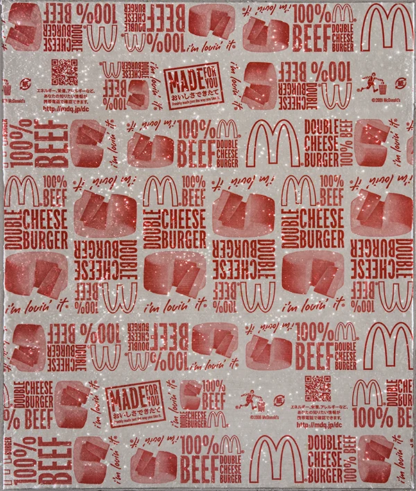
The background colour of the wrapper and the form and arrangement of its printed lettering differ from work to work. The logo may register first; a moment later, smaller lettering and wrapper graphics begin to emerge.
After noticing the colours in the Tokyo work, move your gaze to New Delhi or San Francisco and compare where the same colours recur and where they change.
Up close, different points brighten in each work
The brightness of the small reflective points on each surface changes with the angle of the lighting and the viewer's gaze. A sparkle that appears first in one work may emerge in a different place in the work beside it.
Rather than moving your whole body, shift your gaze slightly from your own place. Watching bright points appear and disappear over colour and lettering introduces a brief sense of time into the still image of the wrapper.
Read the title alongside the wrapper's graphics
Place names such as Tokyo, New Delhi and San Francisco appear in the titles.
After reading the city names, compare the colours and lettering on each wrapper to see how the graphics vary from city to city within the same series. The city titles distinguish works that share a similar format and provide a basis for comparing their differences. Looking at the title and wrapper graphics together connects each work with the place where its material was collected. The same city names appear as the titles in the official works list on Kim Hongrok’s website, kimhongrok.com.
Return to the same wall during the meal
When you take your seat, begin with the wall as a whole. During the meal, choose one or two cities that catch your eye; as the meal ends, return to the full arrangement. Lettering or colours that went unnoticed at first may lead your gaze the second time.
We recommend enjoying the works from your table while you dine. If a particular city interests you, you can find that work in the complete works list on Kim Hongrok’s website, kimhongrok.com.
Questions about viewing the works on one wall
- Where can I find city names such as Tokyo, New Delhi and Warsaw?
- They appear in the title of each work.
- Why are city names used as the titles?
- Each title names the city and country where the wrapper was collected. The titles distinguish the works within the series by city and provide a way to consider their differences.
- Is the entire series currently displayed at Mahina Vegan Table?
- No. 10 of the 30 works in the 2013 McDonald’s series are on permanent display at Mahina Vegan Table.
- What is the simplest way to view the works?
- Begin with the repetition across the whole wall, read the city names in the titles, then compare the colours, lettering and graphics. At close range, notice the sparkle across the surfaces.
Find the cities you encountered at Mahina Vegan Table again on Kim Hongrok's website, kimhongrok.com.
Explore more works by Kim Hongrok